And we say it with pride, wit, and zero apologies.
Although all insurance company put a lot of energy and money to make their product sexy and not boring, it is what it is. And it will always be boring.
So why spend time and money to proof something different?
Although all insurance company put a lot of energy and money to make their product sexy and not boring, it is what it is. And it will always be boring.
So why spend time and money to proof something different?
The Brand Positioning we created is all about that
“Super Boring” is what it is, It is not an insult – it’s the ultimate compliment.
It means reliable, predictable, drama-free protection when life gets chaotic.
By owning the boredom, Deck becomes the most refreshing insurance brand out there.
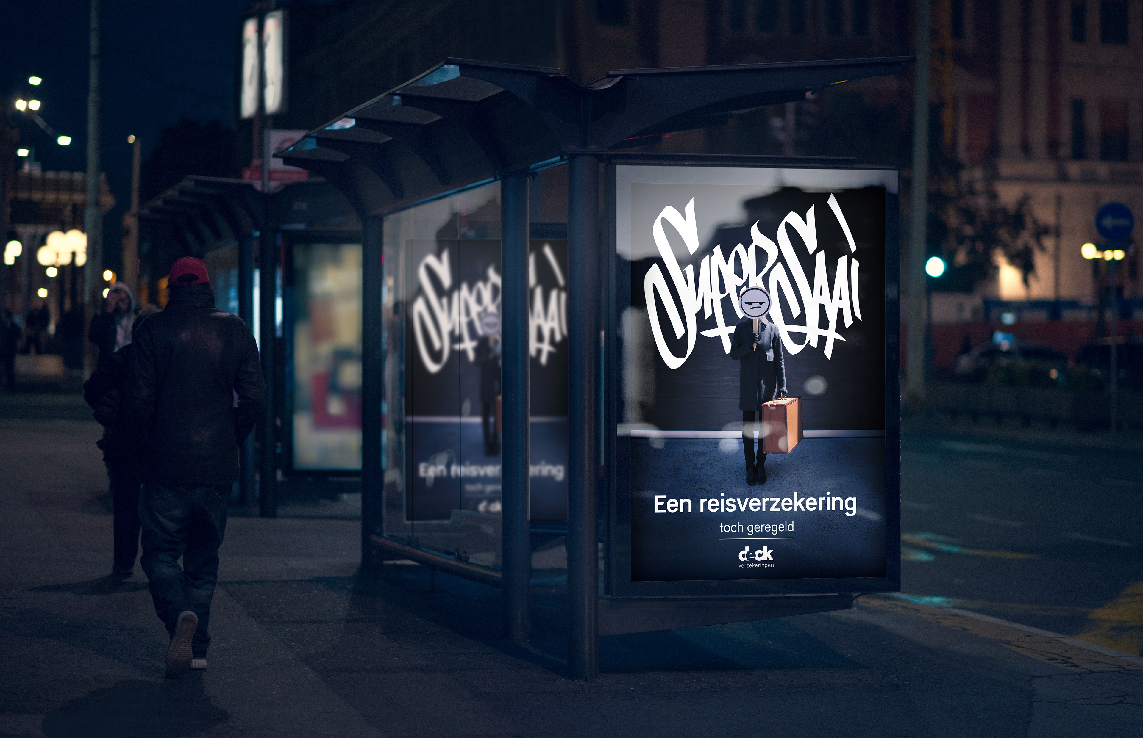
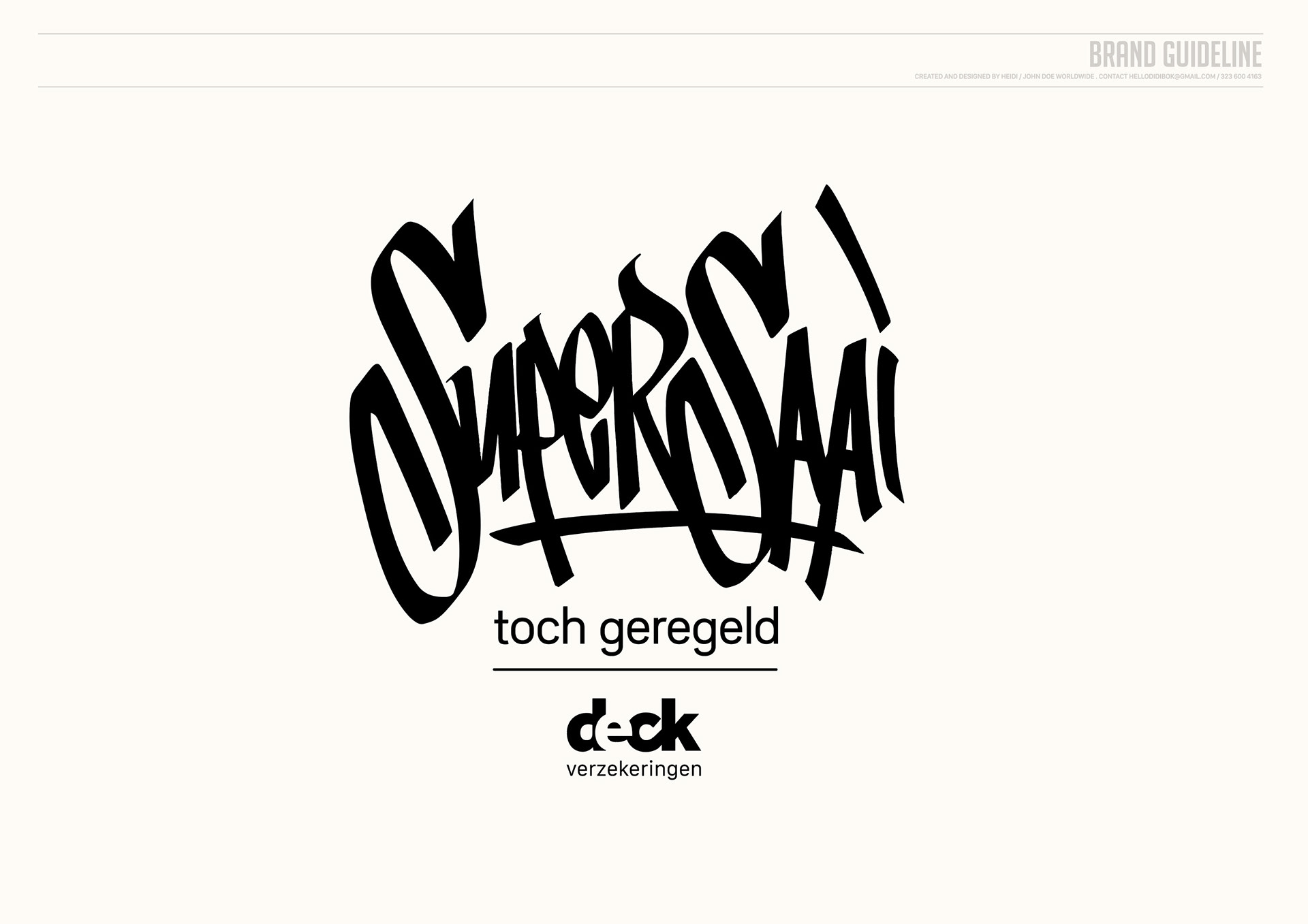
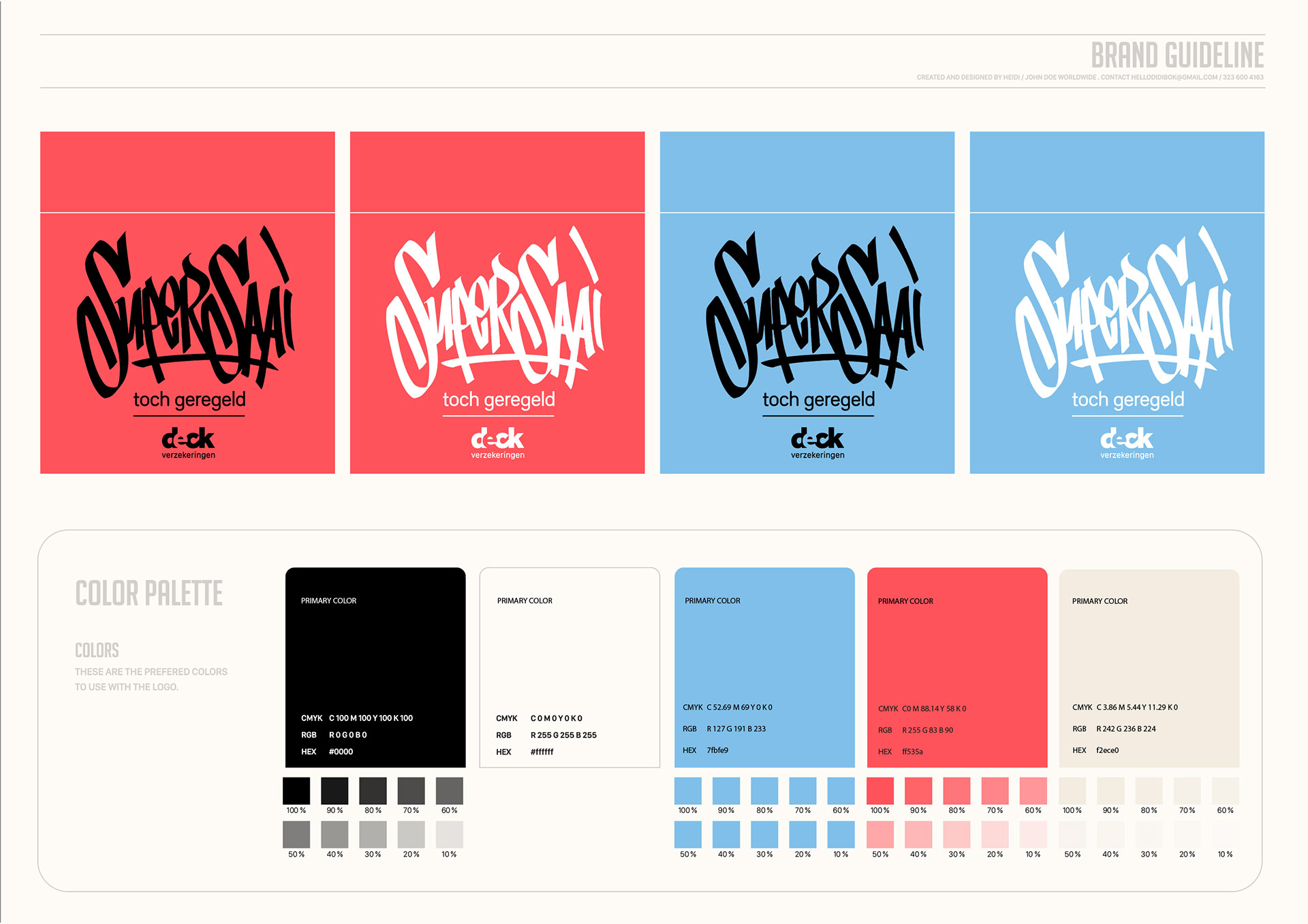
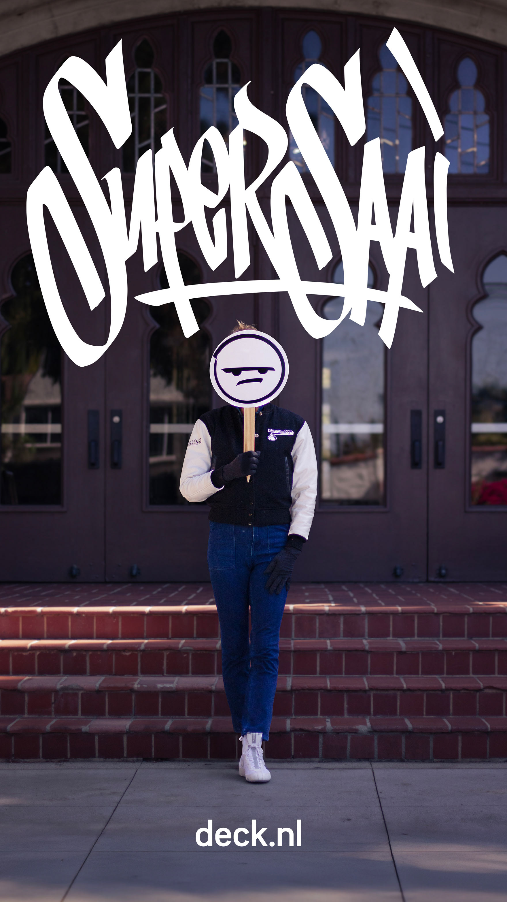
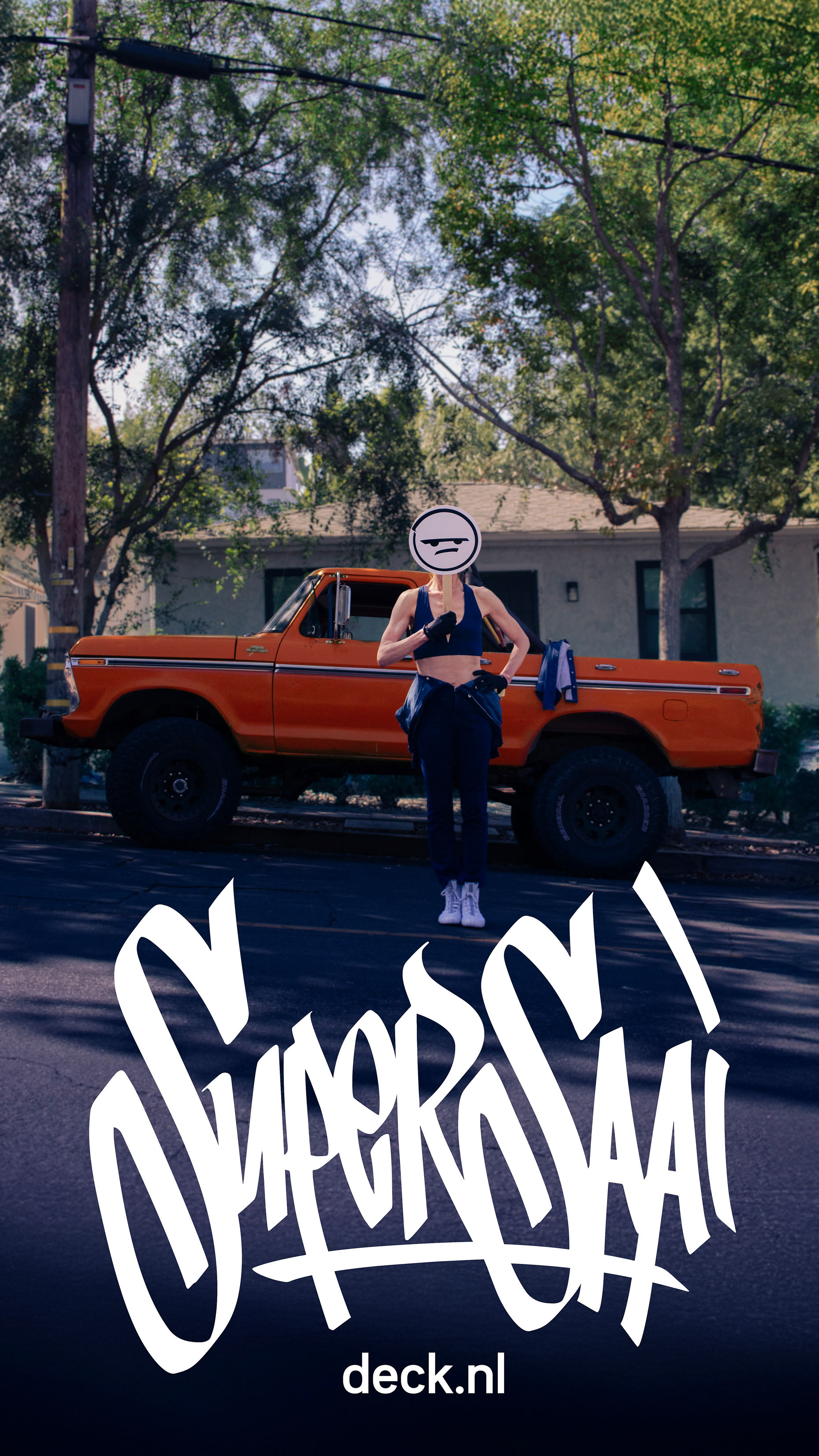
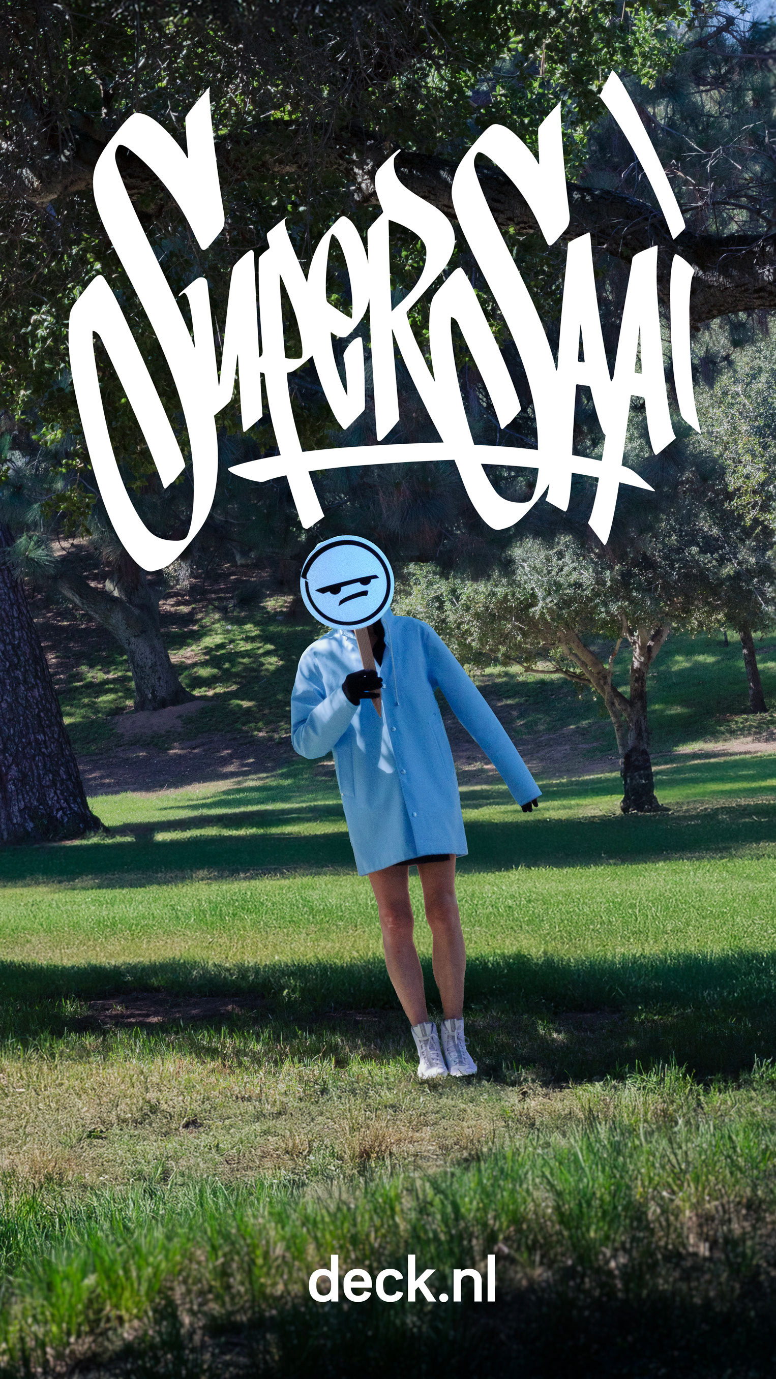
We created a bold visual identity built around a modern logo that integrates the claim “SUPER BORING.” Clean, confident typography meets unexpected high-energy photography, while every execution—from ads and social posts to commercials and PR—contrasts real-life chaos with Deck’s calm, super-boring reliability. Over-the-top, almost absurd situations grab instant attention and perfectly amplify the deadpan “Super Boring” message.
“Super Boring” is what it is, It is not an insult – it’s the ultimate compliment.
It means reliable, predictable, drama-free protection when life gets chaotic.
By owning the boredom, Deck becomes the most refreshing insurance brand out there.
We created a bold visual identity built around a modern logo that integrates the claim “SUPER BORING.” Clean, confident typography meets unexpected high-energy photography, while every execution—from ads and social posts to commercials and PR—contrasts real-life chaos with Deck’s calm, super-boring reliability. Over-the-top, almost absurd situations grab instant attention and perfectly amplify the deadpan “Super Boring” message.
Deck is an insurance brand that finally stands out by embracing what everyone already thinks – and turning it into sharp, memorable, and surprisingly cool communication.
Deck doesn’t try to be exciting. It’s proudly Super Boring. And that makes it unforgettable.
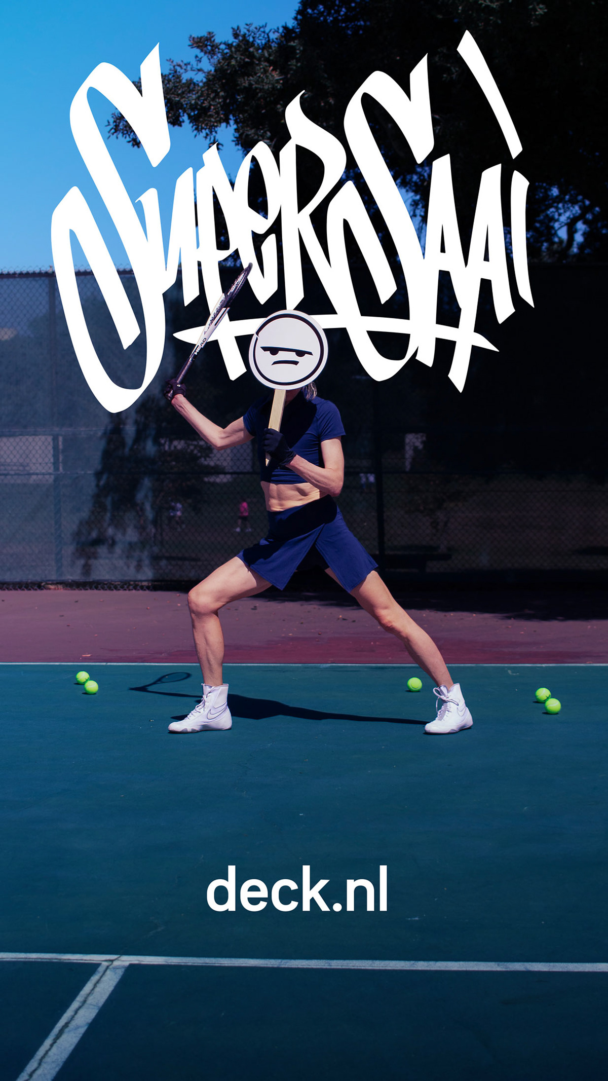
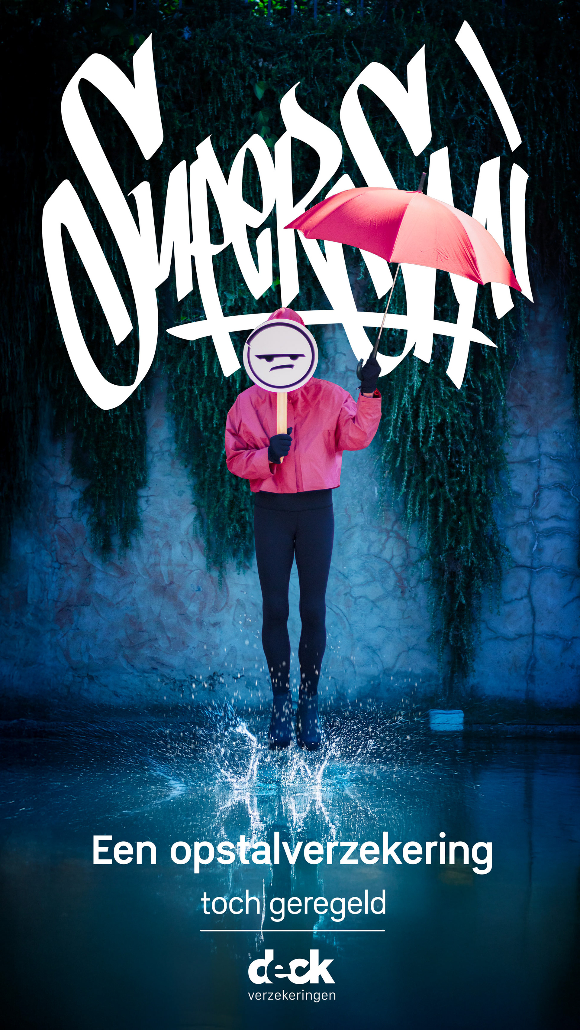
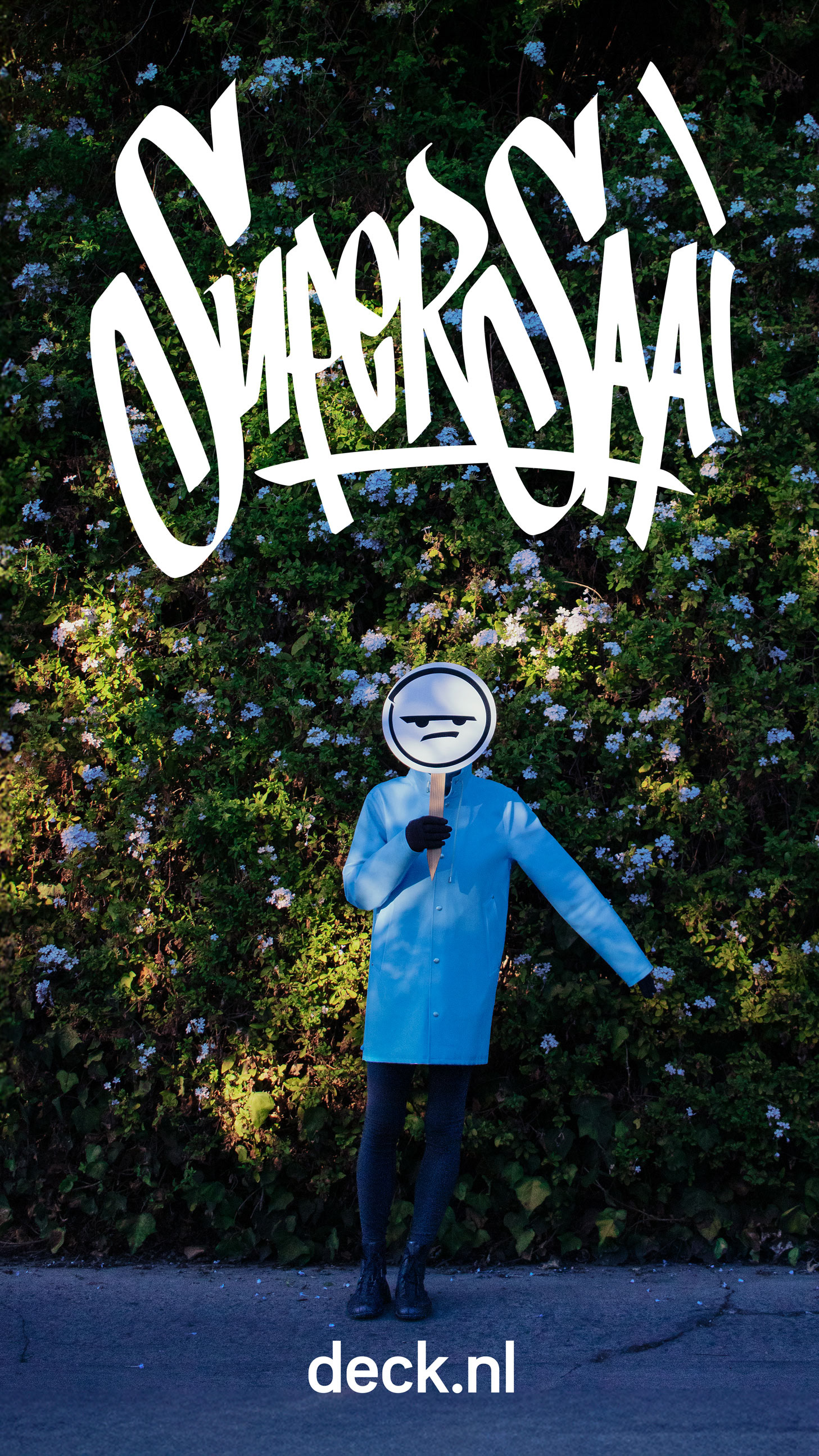
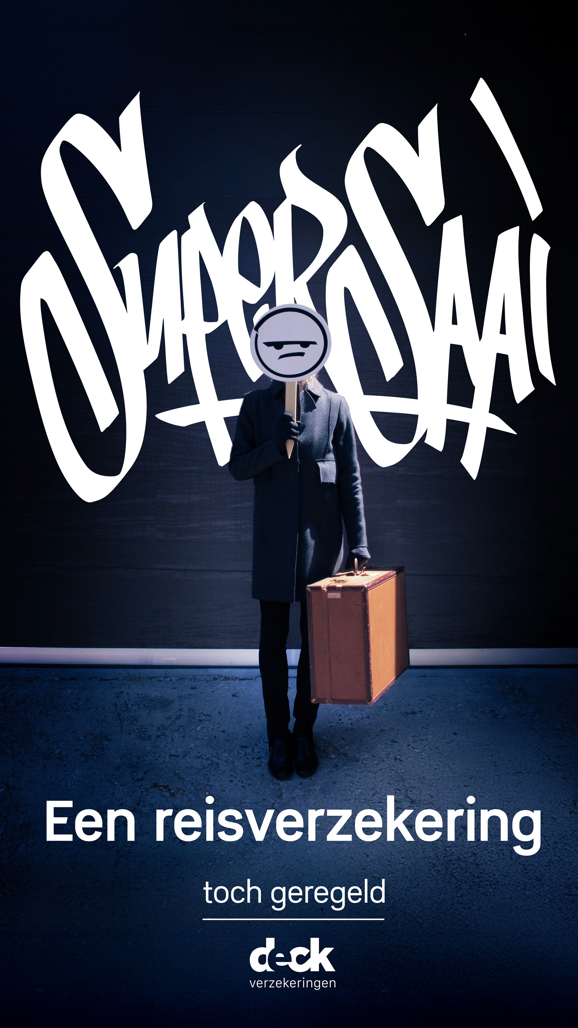
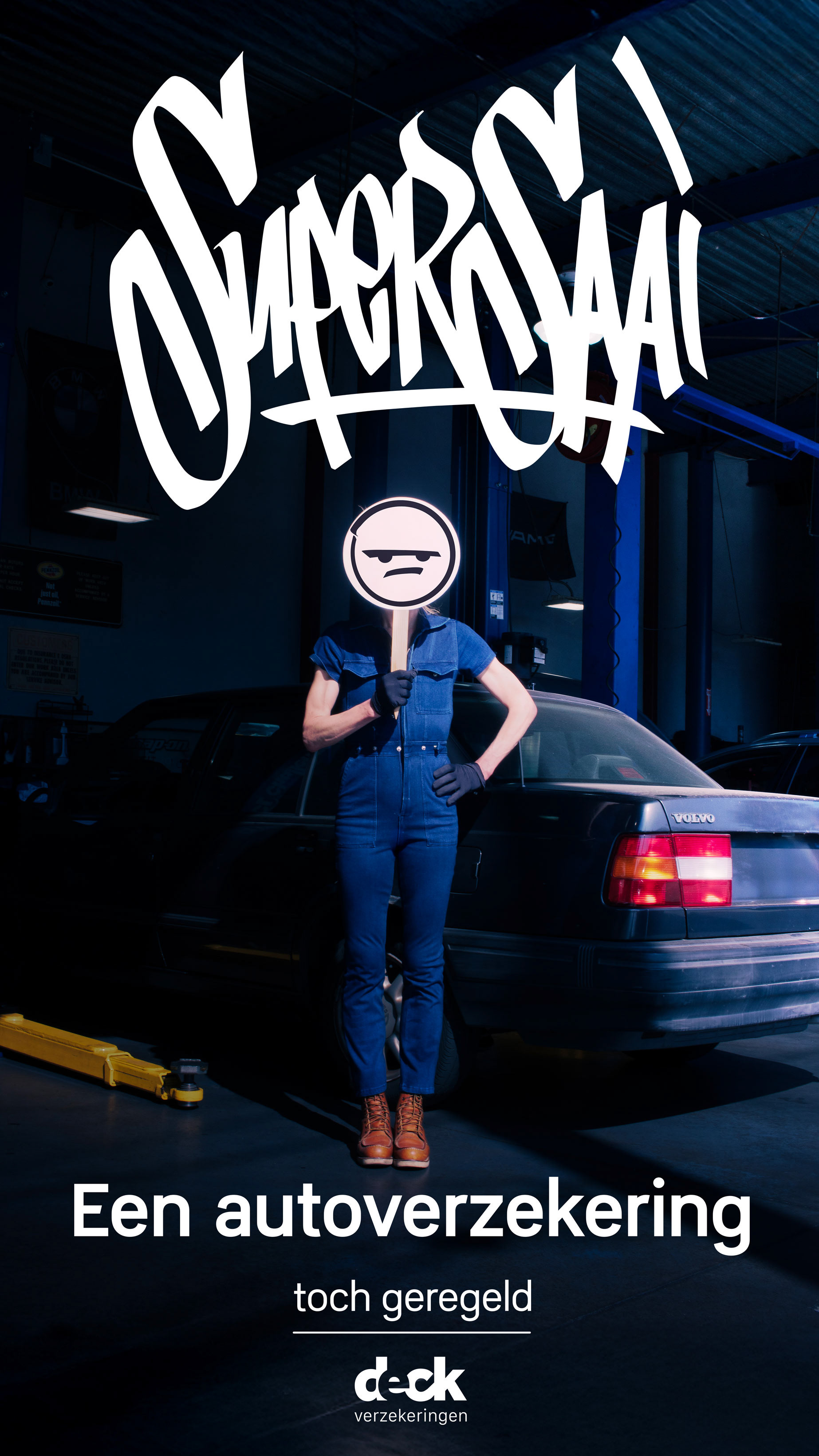
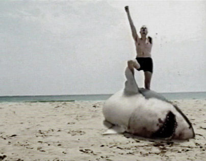
We launched a full-scale online campaign that turns Deck’s biggest weakness into its superpower. Through a series of absurd, playful commercials and ads, we show chaotic real-life disasters—flooded kitchens, runaway llamas, exploding barbecues—suddenly frozen by the calm voice of Deck declaring “Super Boring Insurance.” No drama, no hassle, just instant, effortless protection. The message is clear: we know insurance is the last thing anyone wants to think about, so we made it deliberately, hilariously boring—because in a world gone mad, the most refreshing thing you can offer is total peace of mind.